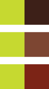
I'm in the beginning stages of honing my marketing for Shannon Miller Creative, and I'm having a color problem. I am in love with the chartreuse/apple green I've already picked, but I need a stronger color to go with it that will contrast well and read easier. At first I thought of a great orange-y, rusty red - one of my favorite colors. But I think that might be too Christmassy, much as I love it. Then of course purple - but I just don't really love the color purple. At all.

My mom suggested brown. I think I like it, but I'm not sure what kind of brown - I don't want it to be too dull, or too dark. I like the reddish tint, but maybe it is still too much Christmas? Thoughts, suggestions from the peanut gallery??


I also like the reddish tint.
ReplyDeleteI like the reddish tint....I don't think that it is too Christmas because the shade of colors. It's not your traditional red and green. Plus, you aren't using them in a Christams scene.
ReplyDelete