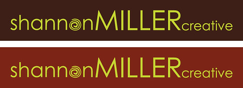
Alright, so after playing more with my browns, I think I am going to have to forego the reddish brown in favor of the chocolate. I love the reddish brown, but I think together it might verge on too funky for some of my client base. The last thing I want to do is scare off a potential client because I'm too weird and they think my branding colors clash.

Thoughts??

I like the dark chocolate brown, too. It makes your name stand out and looks cool with the chartreuse. It's perfect, dahling.
ReplyDeleteI like the chocolate...earlier I thought that maybe it would be too dark but with the green writing, it really POPS! Good job!
ReplyDeleteI like both and I don't think the orange-y one is too funky but chocolate lends itself to sophisticated style more easily. It is probably a good choice since you already have the swirl going too and if you need to reproduce in black and white it will still play well and close to the original.
ReplyDeletemy vote is for chocolate too!!!
ReplyDelete